Japan Green



Details
CLIENT: | 1577 Home Shopping Co., Ltd |
PRODUCT / SERVICE: | Organic Japanese Green Tea Powder |
YEAR: | 2018 |
CATEGORY: | Brand |
SCOPE: | – Logo design – Brand standard & Identity – Package design |
Description
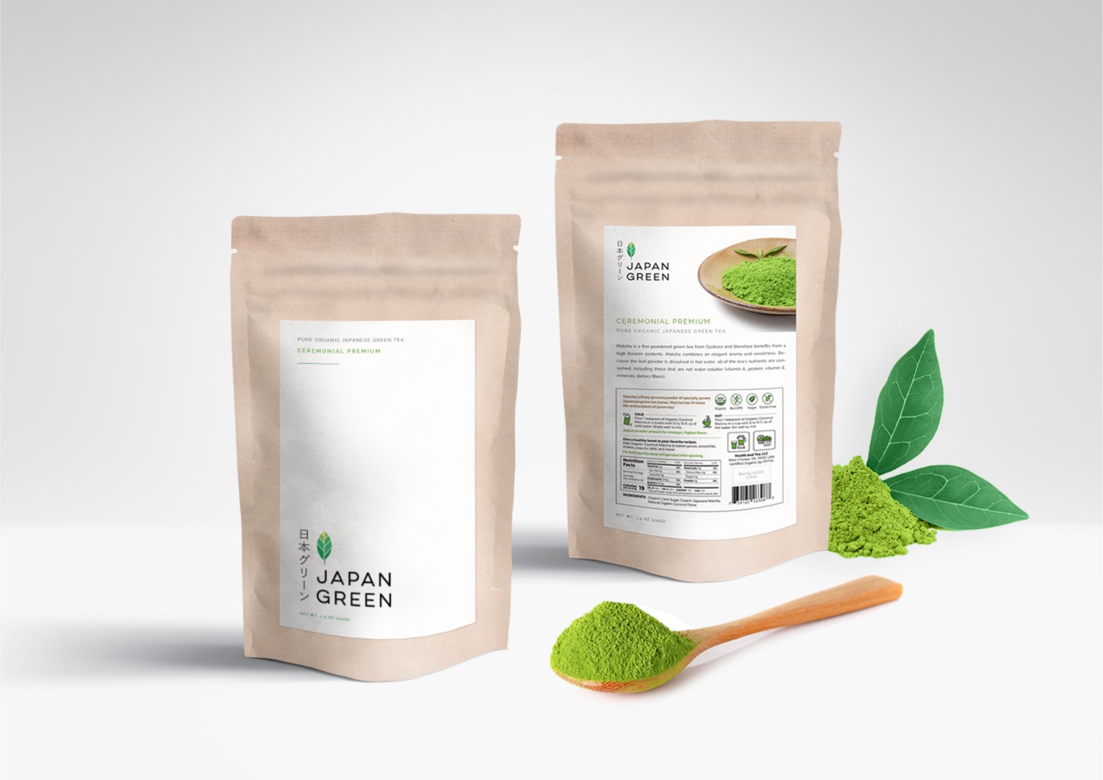
Welcome to Japan Green, where the essence of pure nature is bottled for your well-being. Ever wondered how design could stir emotions and transform products into lifestyle choices? Dive into my design journey with Japan Green Organic Japanese Green Tea Powder and discover how I’ve blended Japanese serenity with modern wellness.
Brand Insights:
Japan Green encapsulates the vitality of nature. It’s not just tea; it’s an embodiment of a healthy lifestyle. In a world racing towards health-consciousness, this brand stands out. With a target audience of health enthusiasts aged 25-45, especially women who adore Japanese culture and the finer things in life, the challenge was clear: convey purity, health, and a touch of Japanese elegance.
Design Alchemy:
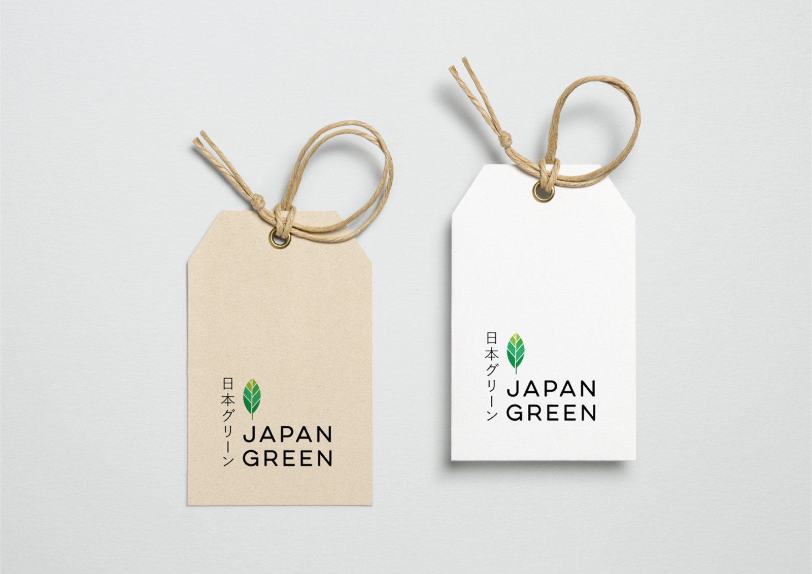
I started with the ‘Visby CF’ font, known for its modernity and cleanliness, echoing our minimalist design ethos. The color palette is a harmonious blend of green and light brown, symbolizing nature’s purity and health benefits. Subtle curves and handmade textures evoke the feeling of a tranquil Japanese garden. Plentiful white space keeps it modern and uncluttered, while sophisticated materials add a premium touch.
Each design detail aligns with customer needs seamlessly. The logo symbolizes a tea leaf, reinforcing the brand’s natural essence. The earthy colors evoke a sense of calm and health. The Japanese influence lends an air of authenticity and trustworthiness, and the minimalist design speaks of a superior-grade product.
In conclusion, Japan Green is a testament to my design philosophy – where every detail serves a purpose, and design transcends aesthetics to tell a story. It’s not just a brand; it’s an experience in a package. 🌿